By Mathias Eichler
The Skyrunner World Series is back in the USA!
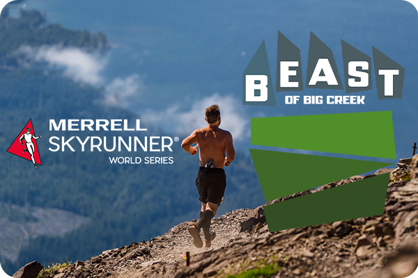
Join us at Beast of Big Creek and race Mount Ellinor with us.
Staying on the “Beast Coast” for this one. Cole Townsend on ‘Running Supply’ shares an email exchange with Ben Cooke, President of Marathon Sports and some thoughts on their brand new rebranding:
The new Marathon Sports is modern, sharp, and geometric. It doesn’t have the warmth of a slab serif typeface or their clip art image of Bannister breaking the tape.
…
This ambitious play comes with some risk. Stores like Fleet Feet and Marathon Sports are trusted by a huge community of runners, walkers, and hikers. It’s a familiar place to shop with all the brands they expect.
Aside from the fact that I’m very interested in design, and to that a bit more in a little bit, one of the reasons I am bringing this up here is this part of the interview with Ben:
In trail, we bought races, amplifying them with real prize money—championship status, and deep prize money to support aspiring athletes and keep them in the east. [New] field trip experiences to get people opened to trail, an adult camp in the Berkshires. Additionally we are building a trail mecca store in North Conway to honor the sport. We almost feel an obligation to do these things. If not us, who else will?
Marathon Sports bought SIX03 the company behind Kismet Cliff Run – now part of the USA Skyrunner National Series. Which coincidentally also has the tagline “Beast of the East”. So we will be seeing alot more from them in trail in the coming years.
Switching over to the official blog post and announcement by Marathon Sports on their rebranding efforts:
We wanted an identity that respects that history, but also looks and feels ready for contemporary run culture. That is a delicate balance. We selected Upstatement, local design agency, to guide this process. Their editorial mindset, blending disruptive design and storytelling, captured Marathon Sports’ identity and pushed us further than what felt familiar.” – Ben Cooke, president of Marathon Sports.
Logo and brand refreshes are hard and I am not one to do the usual internet pile on here of yelling at how the old one was better and the new design is automatically shit, but this sentence below has my skin crawl:
Upstatement must have drawn over a hundred running figures, a million variations of the letter M, and everything between the sky and the ground, including a hedgehog and banana peels.
I really really hope this is meant as a figure of speech. A casual way for a not-a-designer explaining the process of how one goes about redesigning a brand with 50 year history. Because man, you definitely don’t start with the drawings, you start with the emotion, the feeling, the idea and vision of what you want to convey.
Look closer and you’ll also see a runner breaking the tape, arms raised in that split-second mix of exhaustion, relief, and disbelief. It’s the moment every runner understands whether you’re winning a race or just winning a personal battle on that day.
These two symbols; the four dots and the upraised arms are universal among all forms of running. They are road, trail, track and treadmill and they are the essence of our sport.
A smart designer can explain any shape into anything. This above feels a little bit like a stretch to me. The new logo is a modern and abstract *M*, and that’s just fine.
Sign up and never miss a story.

Electric Cable Car is a owned by Einmaleins and part of trail. run. film. Productions. ©2026. All Rights Reserved.